
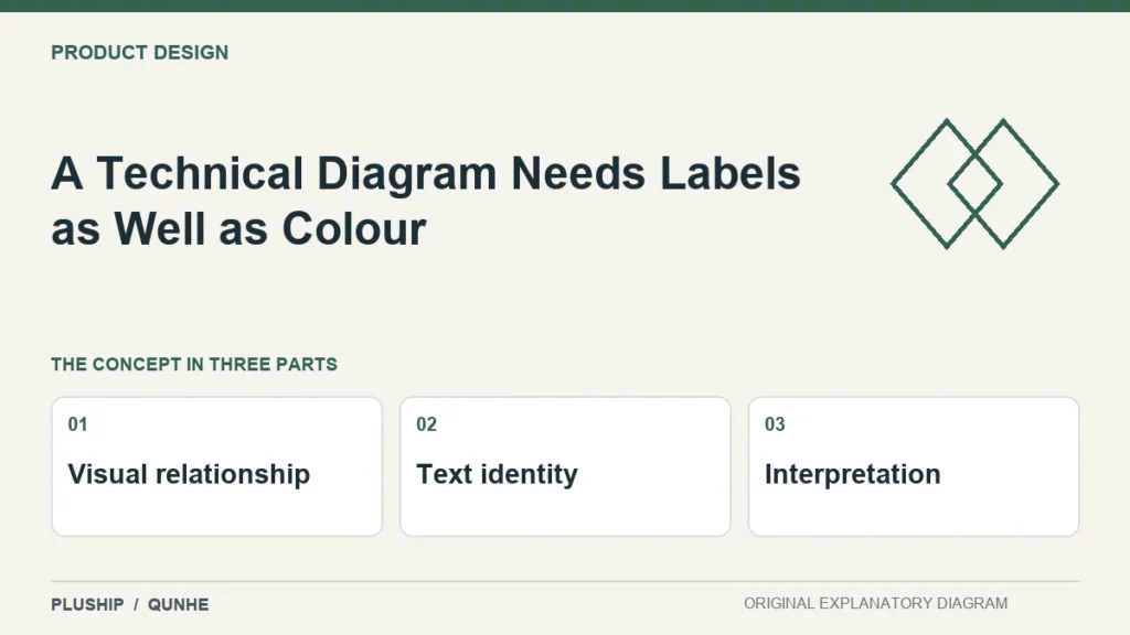
A process diagram can become difficult to interpret when its meaning depends on red, green or another colour alone. Give each important element a readable identity.
W3C's web guidance recommends information in addition to colour when colour differences convey meaning. Understanding SC 1.4.1 Use of Color (Level A).
Name the relationship
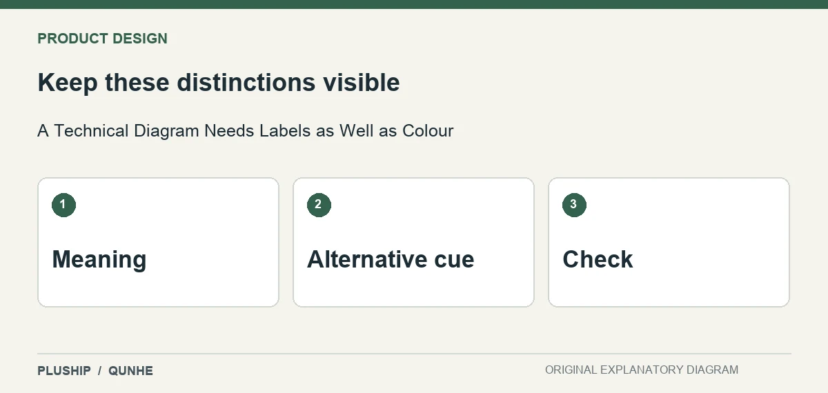
In a digital design-review diagram, label the stages and state what the arrows mean. If a colour indicates an unresolved item, add a text status. Do not expect a reader to infer the same meaning from an unlabelled palette.
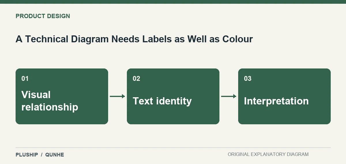
Check the reduced view
Open the diagram at its actual placement size and inspect whether the labels remain readable. Keep the essential explanation in surrounding page text too. A high-resolution image is not useful if the page reduces it until the key distinction disappears.
The useful result is a diagram people can understand through more than one cue. Clear labels also make the figure easier to discuss, translate and trace back to a specific design decision.
Source reviewed 25 October 2026. Practical interpretation and original illustrations by PLUSHIP / Qunhe; examples are illustrative.
Related reading
A Colour-Difference Number Still Needs an Acceptance Method
A Material Trial Needs an Identifiable Baseline