
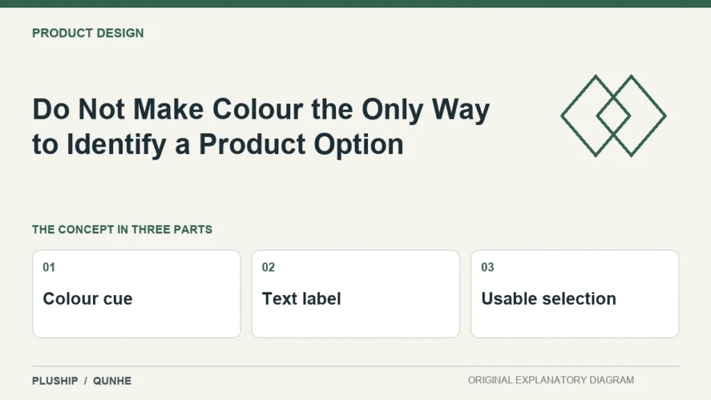
A colour swatch can help someone browse, but it should not be the only way to identify an option in a digital buying interface. Add a clear label that survives different ways of seeing the page.
W3C's Use of Color guidance says colour should not be the sole visual means of conveying information in web content. Understanding SC 1.4.1 Use of Color (Level A).
Give the option a readable identity
Use a visible option name and retain the stable reference where relevant. Check selected and unselected states without relying only on a subtle hue change. A buyer should be able to confirm the choice from the text as well as the appearance.

Test the handover
Check that the selected name reaches the enquiry or review record. A clear interface can still lose the choice if the next message contains only a product family name. Keep the actual destination output in the test.
This is a digital information-design consideration. It does not establish an exact physical colour match, which needs its own product-specific reference and review method.

Source reviewed 25 October 2026. Practical interpretation and original illustrations by PLUSHIP / Qunhe; examples are illustrative.
Related reading
Make Product Design Trade-Off Criteria Explicit
Colour Coordinates Add Precision Only When the Method Is Clear