

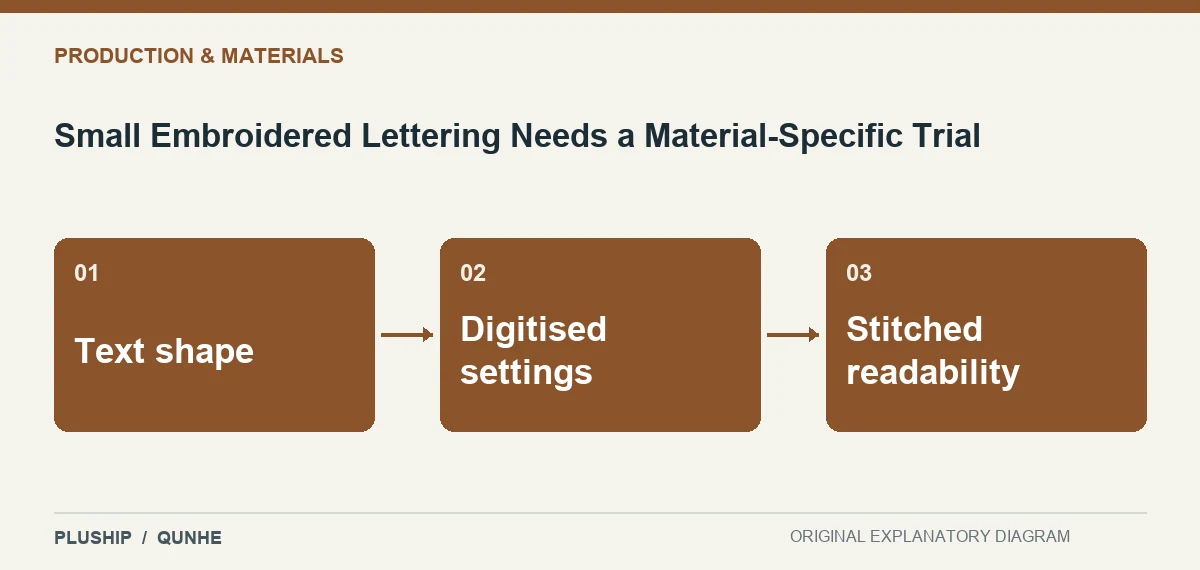
Readable screen text does not guarantee readable embroidery. The letterforms interact with the thread arrangement and the material on which they are stitched.
Wilcom explains that production lettering requires settings suited to the chosen fabric. Wilcom — Production-ready lettering.
Inspect more than nominal size
For a character name, examine narrow openings, adjacent letters and the actual viewing conditions. A font that looks suitable in vector artwork may require another embroidery treatment.
Keep the trial identifiable
Compare the sew-out on the intended material and retain the relevant file and settings. Do not adopt a universal minimum letter size from an unrelated sample. The approved result should remain connected to the actual lettering, material and production approach evaluated.

Source reviewed 25 October 2026. Interpretation and original diagrams: PLUSHIP / Qunhe. Examples are illustrative.
Related reading
A Mixed Textile Needs a Specific Recycling Pathway
A Blend Percentage Needs a Clear Material Boundary